
USGS Shares Wellspring Of Insight On Groundwater Trends

If your customer base is among the 140 million people who depend upon groundwater for drinking water, irrigation, or agriculture, it is important to know whether you can expect the quality of your source water today to be the same tomorrow. Fortunately, a recent update to the first-of-its-kind assessment of trends in groundwater supply has been announced by the U.S. Geological Survey (USGS) to help you identify emerging problems. The results are detailed in an informative and easy-to-use interactive map.
Forewarned Is Forearmed
No one likes to hear bad news. On the other hand, having an indication of potential groundwater quality issues that might be coming your way can be helpful for planning appropriate technical strategies to deal with those changes.
The USGS Report on Decadal Change in Groundwater Quality tracks changes in 27 principal aquifers that represent more than 90 percent of the groundwater supply accessed for public use. The study was developed as part of the USGS National Water-Quality Assessment (NAWQA) Project. The results of the effort document trends over three separate decades — the 1990s, 2000s, and 2010s.
The highly interactive map (Figure 1) used to visualize the results makes it easy to drill down by major aquifer, by chemical constituent, and by survey parameters for a given location to gain greater understanding. A User Guide on the homepage map outlines how to adjust the base map style, change or add map layers, and target specific constituents.
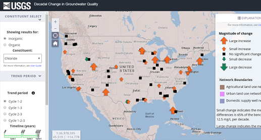
(Map image courtesy of U.S. Geological Survey)
Figure 1. This interactive USGS website provides trend data across multiple pollutants, down to the local level.
The Plan Behind The Program
Samples were collected by teams from USGS Water Science Centers across a total of 5,000 wells in the 27 major aquifers nationwide during the period from 1988 through 2014. Samples were evaluated and analyzed by NAWQA Project staff in clusters of up to 20 or 30 wells with similar characteristics in a geographic area (Figure 2).
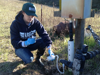
(Photo courtesy of U.S. Geological Survey)
Figure 2. More than 5,000 well samplings were taken over the course of 26 years to create the USGS interactive map.
Not all wells were tested on the same schedule, but the interactive map of the project identifies the sampling timeline of each geographic area. Samples were drawn mostly from monitoring wells and domestic-supply wells. While those types of wells tend to represent the shallower parts of an aquifer, the data can provide insight to possible future changes for deeper well zones used for public supply. One of multiple data features in the map is the ability to screen results by constituent category or by specific constituent, including:
- Inorganics — Arsenic, boron, chloride, fluoride, iron, manganese, molybdenum, nitrate, orthophosphate, sodium, strontium, sulfate, total dissolved solids (TDS), and uranium.
- Organics — Atrazine, chloroform, deethylatrazine, dieldrin, methyl tert-butyl ether, metolachlor, prometon, simazine, tetrachloroethene, toluene, and trichloroethene.
According to the USGS website, those mapped constituents were chosen because they met one of the four following criteria as defined by previously conducted studies:
- Constituents that exceeded a Maximum Contaminant Level or other human-health benchmark in more than 1 percent of public- or domestic-supply wells, or
- Constituents that exceeded a Secondary Maximum Contaminant Level or taste threshold in more than 1 percent of public- or domestic-supply wells, or
- The five most frequently detected pesticides and volatile organic compounds (VOCs) in groundwater, or
- Constituents of special or regional interest.
A Wealth Of Supporting Knowledge
While water utility operators will be primarily interested in their own aquifers, the interactive features in the map make it easy to see a snapshot image of the whole country to assess the relative progress or deterioration of conditions nationwide. Size and color-coded icons indicate the relative changes — large increase, small increase, no change, small decrease, or large decrease — for clusters of wells in specific aquifers. Clicking on any one of those icons opens a separate window that lists the type of well sites tested, well depth, principal and regional aquifers involved, aquifer characteristics, and sampling dates (Figure 3).
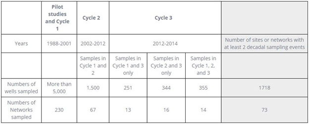
(Chart courtesy of U.S. Geological Survey)
Figure 3. More than 1,700 well sites were sampled with at least two decadal sampling events to provide the comparative trends displayed in the interactive map.
Beyond the specific information about the decadal change in groundwater quality, the Related Resources selection in the header bar of the initial webpage load also provides a host of convenient links to a variety of additional helpful resources for drinking water suppliers. This includes links to several related USGS resources — such as the NAWQA Project and other aspects of water quality — as well as links to other federal agencies such as the U.S. EPA and U.S. Department of Agriculture (USDA).
More data about the study, including downloadable data, is available via the data link in the top navigation bar of the webpage.
For utilities that draw from surface water resources as well, the website also includes links to Water-Quality Changes in the Nation's Streams and Rivers and Tracking Water Quality of the Nation's Rivers and Streams.