
"One Water" Communication: Language, Icons and Industry Color Palette

Water is a multi-faceted good and a global priority that affects human beings and the wellbeing of companies and institutions that need water to survive. Those interested in shaping the future of water management are pushing the notion that water is water, whether drinking water, storm water, rain water, or used water. Doing so, according to the experts, encourages "comprehensive thinking, planning and management of our waters on a transformational scale” and pushes the industry towards a “one water” resource management.
If we are to make water everyone’s business and improve stakeholder understanding and support, we also need a complementary one water communication to advance the important goal of one water resource management. Engineers, scientists and communication professionals serving the water industry must address the communication challenges around water in a holistic way and create a universal objectives framework to support and guide the growing number of voices supporting water.
Through these actions, we can shape the thinking of the current generation, stimulate ownership, and enhance awareness about the sustainable use and economic importance of water. We need to teach people how to value our water resources by regularly providing positive storylines about water and the cycle of water in language, concepts and images that they can understand.
Technical Buzz Words and Media-Driven Slogans Create Confusion
Technical terminology oftentimes does not facilitate the level of understanding that we seek. And, when it doesn’t, it’s easy for the media to “sloganize” the meaning (e.g., toilet-to-tap or the “yuck factor”) with terms that don’t give justice to important and sustainable water processes and the water stories that we all need to hear.
We need to reclaim water from the media-driven clichés and technical buzzwords. We need to eliminate stigmatizing language. Buzzwords create confusion. Additionally, it’s hard to clean up or un-name processes that have been labeled with negative terminology or language with inherently negative connotations. I hesitate even including those terms here because of the damage it does to our effort to educate the public on water issues and our ability to tell the full water story.
However, we must look beyond language we use to communicate about water. Communication about water has iconic and color constraints and inconsistencies as well.
Looking Beyond Language
Recently, at a high profile, global international conference whose theme was to enable societies to get more value from their water systems, attendees were asked to fill out a survey on the language of water. This survey stimulated my interest in examining how we communicate about water and the language that we use to describe water.
But, I didn’t stop there. I looked beyond language. I examined our visual (e.g., graphics and color) representations of water and the water treatment cycle. Water communication is muddled by:
- Overuse of engineering terminologies and technical buzzwords
- Media -driven clichés and stigmatizing language
- No standardized color palette
- No standardized or common icons
- Inconsistent use of colors and icons representing the water cycle, water processes, equipment, etc. (e.g., while Irvine purple was chosen as a color to differentiate between pipes that carry recycled water and those that carry drinking water, the variety of the colors in use by the industry range from pinkish to dark purple).
There is clear evidence that the water industry needs its own color palette and industry specific icons to drive standardized communication and to change the one water communication paradigm. Can you imagine the consistency in communication if the entire industry used the same color palette and icons to communicate visually about water?
I recently reviewed a well-designed infographic published by an international organization with major investments in the water sector. The product showed purple pipes mapped into a “house” delivering water to the kitchen sink, bathtub, washroom tub, and bathroom lavatory. As we all should know, purple pipes carry a lower grade of semi-treated water for use in gardens, washing cars and flushing toilets, but certainly not for drinking or cooking.
This is an example of a missed opportunity to educate the public about water. I came across many more. The research I conducted brought home the fact that at a minimum we need to establish a visual, conceptual framework to communicate about water beyond just the hydrological cycle. When asked, most people do not know where their drinking water comes from.
Language Important, But Icons And Color Also Influence Perceptions
Language directs and influences our thoughts and helps us to understand concepts of time and space. Language affects how we conceptualize the world. Language plays an important role in shaping our realities, perceptions and understanding, but so do icons and the use of color.
I believe that with this combination, we can influence cognitive processes (e.g., thought and experience). While I am no expert in the principle of linguistic relativity, I do know that we are often at the mercy of our language and symbols. This puts pressure on those who communicate about water to take extra care in the language, signs, symbols, and colors we use.
Visual Conceptual Framework Needed For Water Communication
Charles Fishman, author of The Big Thirst says, “Water expressions infuse our language … (b)ut we don’t really have much of a language or a framework for talking about water itself” and “(o)ur everyday attitude about water is filled with contradictions.”
He says that our very success with water has allowed us to become water illiterate. “We are on the verge of a second modern water revolution—and it is likely to change our attitudes at least as much as the one a hundred years ago. The new water scarcity will reshape how we live, how we work, how we relax. It will reshape how we value water, and how we understand it.”
In my opinion, this effort should include more than developing a common language. We need a visual conceptual framework that facilitates more exact and consistent communication about water. We need to create awareness about water issues, develop a water ethic, and change behavior at the citizen level towards our most precious resource on earth. We can do that through standardized visual communication.
Informed perceptions increase public confidence. That’s good for both utilities and for the public. I am fully convinced that for water communication, we need pervasive terms, labels, icons, colors and a simplistic categorization that correctly reflects the realities of water.
The Roa Conceptual Model for Water Communication™
I believe that we need to acknowledge the impact of language and make a concerted effort to provide a linguistic and visually accurate conceptual window into the world of water. I believe that The Roa Conceptual Model for Water Communication™ and accompanying water icons and color palette provides a framework for standardized visual communication about water and aid us in expressing the spirit and nature of water.
The model below visually represents the water treatment cycle in a simplistic, user-friendly way. Tested and reviewed by industry colleagues, water engineers, and school children under the age of 16, this figure drives home the messages that water is water, water is treated to different classes or levels of water quality, the cycle is closed looped, and there are many resources to be extracted from water that has been used.
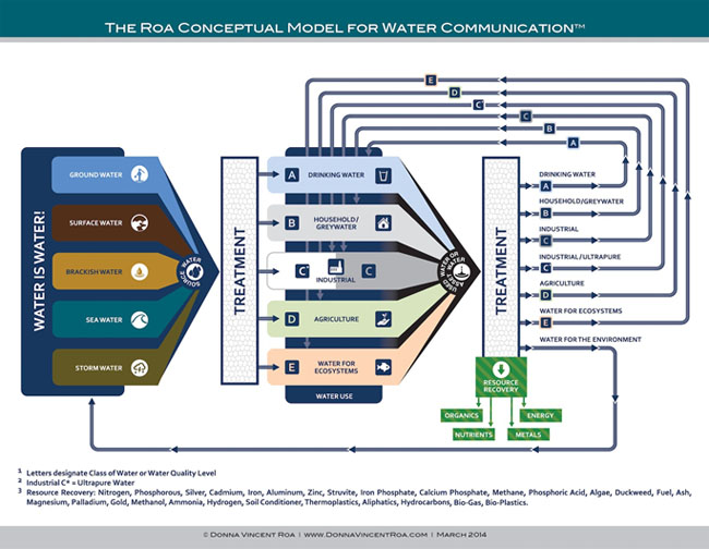
Language coupled with standardized visual cues can create sensory representation to support linguistic representations. By using all three – language, icons, and colors – we can shift our understanding of water and its value to society.
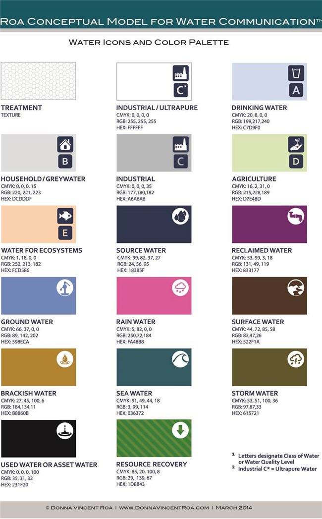
The Water Icons and Color Palette include carefully selected colors and iconic designations to represent the various types of water and to define water quality levels as well. The logic behind the choices can be defined as follows:
1) A universal “texture” symbol was chosen to symbolize water treatment
2) A color was chosen to most closely represent the kind/type of water it was set to represent
3) Icons, which include the chip of color or color in the internal object design, were created to compliment the color representation
4) The A, B, C, C*, D, E letter icons represent or designate the classes of water or water quality level
5) The CMYK, RGB, and HEX coordinates are provided to ensure color use accuracy and consistency in the development of water communication materials (e.g., education materials, infographics, technical white papers, marketing materials, videos, PowerPoint, etc.).
Why We Need Standardization
I believe that we value what we understand. We use scales, models and frameworks to help us understand complex matters and materials. Review the conceptual models and categorization efforts of Daniel Defoe, Charles Darwin, Anders Celsius, John Smith Elgin Marbles, Seamus Heaney, Tycho Brahe, Captain Bligh, and my favorite, Rear Admiral Francis Beaufort, author and developer of the Beaufort Wind Scale.
Study the naming of wind and you’ll find that getting to a standard was not easy. At the time, Rear Admiral Beaufort, hydrographer to the British Admiralty and an Irish Royal Navy officer, developed the Beaufort Wind Scale, there were many wind scales in use. The profusion of scales led to much confusion and inaccurate measurement and communication about wind.
If you’ve never seen the Beaufort Scale, it is one of simplicity and clarity with only four categories in the table: Beaufort number (0-12); name; wind speed; description. Midshipmen in the Navy learn Beaufort scale. Sailing courses include instruction on it.
Beaufort succeeded in standardizing the way those who made weather observations could provide objective and concise descriptions about what they saw. The modern scale uses colors (e.g., spanning from a light teal to orange and red), concise labels and descriptions, sea conditions, numbers and photos to indicate the level or force of the wind. Some versions include a variety of pictures illustrating the wind’s force.
Beaufort’s intentions were to shape the views of the world on wind. I believe that we have a similar opportunity to shape the views of the world on water.
Social Codes and Systems Based on Color
Throughout history, we’ve had an affinity for categorizations, including using color to categorize. All societies have social codes and systems based on color – from the Roman period through the Middle Ages to the church’s use of color for symbolic and practical purposes to the use of color categorization in present day design and communication.
Color categorization is a familial concept and a universally understood framework that has the potential, when used correctly and consistently, to enhance understanding and carry messages.
My goal with this project was to develop a simple taxonomy and clear framework that would help to standardize visual communication for water and could be used by water associations, water utilities, engineers, scientists, water leaders, water communicators, and others worldwide to communicate visually about water.
Let’s Start with Water Associations and Water and Wastewater Utilities
We should start the standardization process with water associations and water and wastewater utilities, but certainly not stop there.
Water and wastewater utilities face unprecedented fiscal, aging infrastructure, affordability of service, management, operator training, regulatory, treatment, and weather-related challenges. More often than not, the voice of the utility amidst these challenges is not heard or represented in its various stakeholder communication channels. That can change.
Water and wastewater utilities no longer have the luxury of being the “silent utility” that no one talks about until a water main breaks or there is sensational coverage of a security-related issue or water disaster. As utilities undergo quantum changes brought on by these challenges, efficient asset management is critical. Integrated management plans for the utility of the future must have a stronger emphasis on strategic communication. A solid communication portfolio and standardized color palette and icons can and should be positioned as utility assets.
Strategic communication, coupled with leadership support and sufficient resources, can help water and wastewater utilities achieve their mission and position a utility as vital enterprise, essential to thriving, sustainable communities. Strategic communication can also improve the public perceptions of the value of water and of the water utility.
Conclusion
It’s been said by water utility leaders that the single greatest benefit to water infrastructure asset management is our ability to explain water. We can and need to improve the way we communicate about water and the value of water to society. Informed and educated stakeholders will think about, value, and manage water in a different way, and that is a very good thing.
A standardized communication effort will add value to our efforts in achieving this goal.
Access to The Roa Conceptual Model for Water Communication Files and Icons
Access this link to download a zip file that includes high quality jpegs of the model, the color palette and the industry icons.
I invite your participation in using the model and the accompanying tools (conceptual model, water icons and the water color palette) to help you communicate about water. I also invite your comments and feedback. If you would like to send me a sample of how you used these tools, please send to donna@donnavincentroa.com. I will feature some of the outputs on my blog Speaking Up About Water.